HabitlyHome Brand Identity & E-Commerce Interface Design
Stack
Adobe Illustrator, Adobe Photoshop
Timeline
Not specified
About Project
Structuring a global e-commerce brand identity
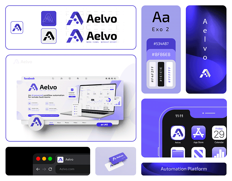
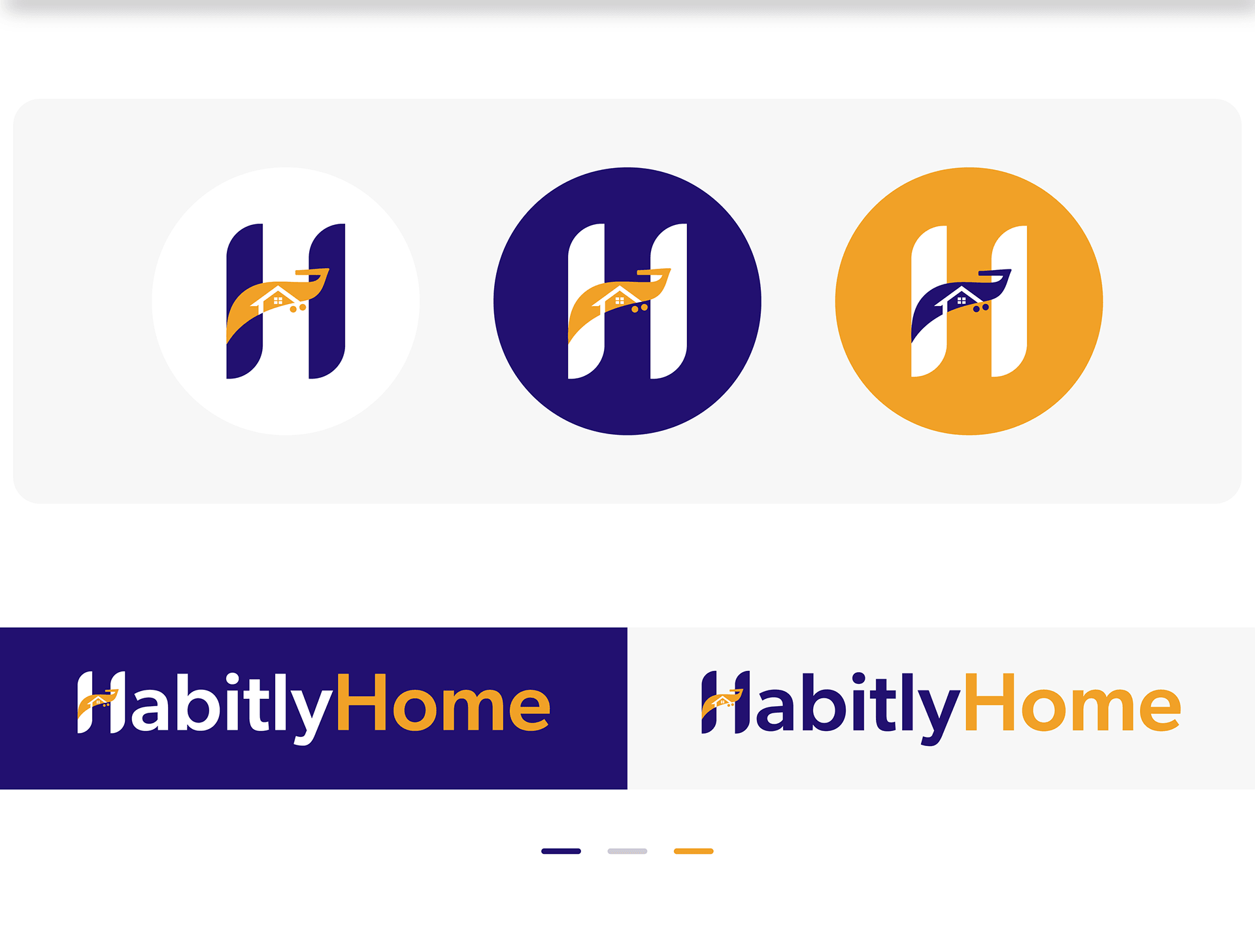
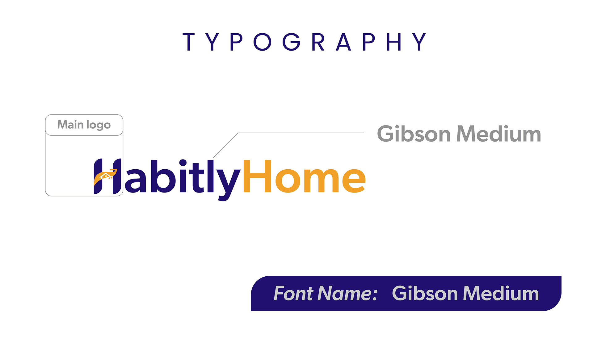
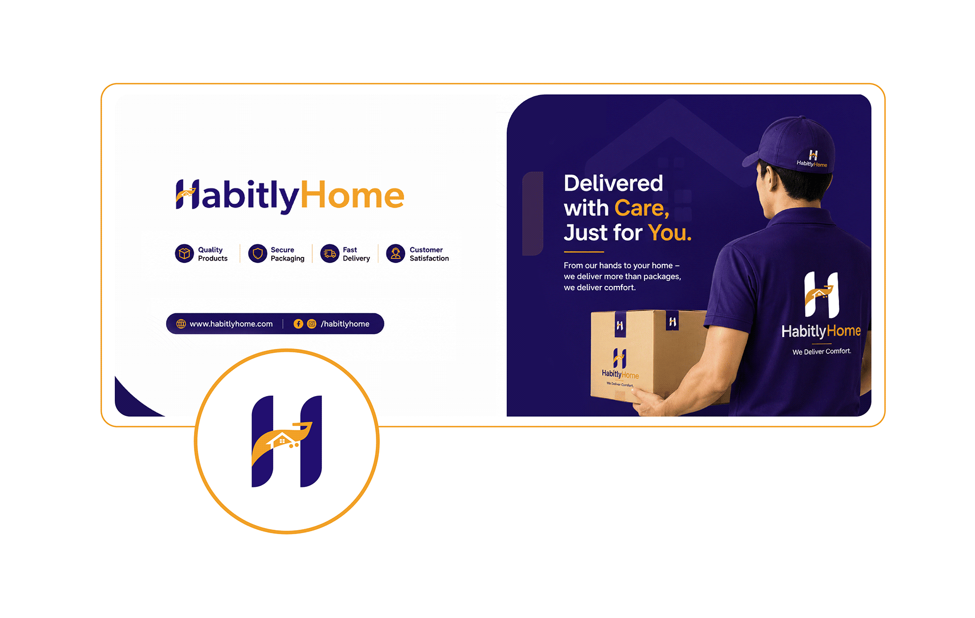
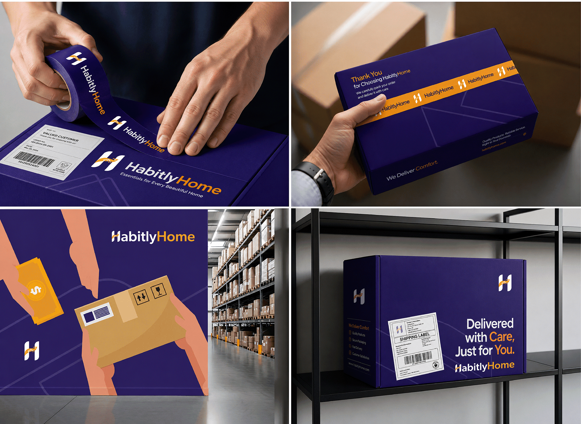
HabitlyHome needed a comprehensive brand identity system to establish trust across international markets for home goods, furniture, and kitchenware. We crafted a distinct logo mark centered around a bold serif-influenced 'H' enclosing a house icon and curved delivery motif.
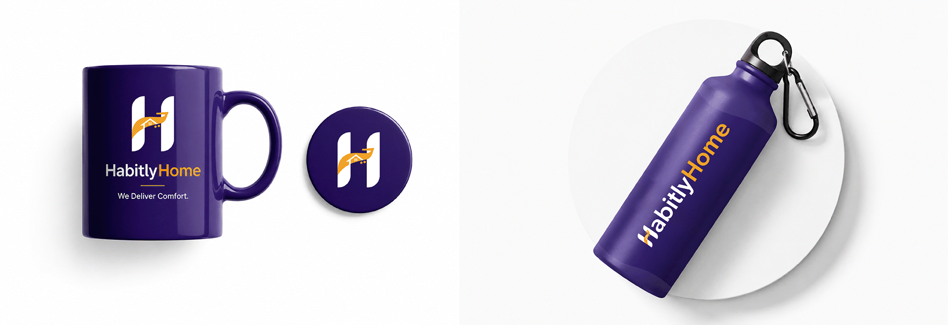
The visual mark operates flexibly on dual colorways: a rich navy base paired with a warm golden accent. The wordmark combines deep navy for 'Habitly' and bright gold for 'Home', visually separating the brand name while maintaining balance.
Color palette, typography, and cross-platform assets
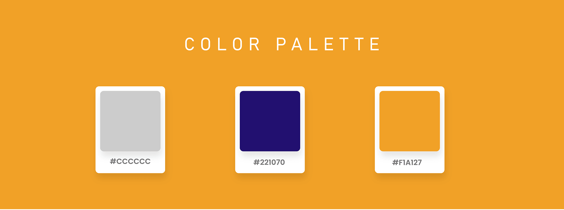
Our design system establishes clear rules for digital applications, marketing collateral, and packaging materials. The primary palette relies on three core shades:
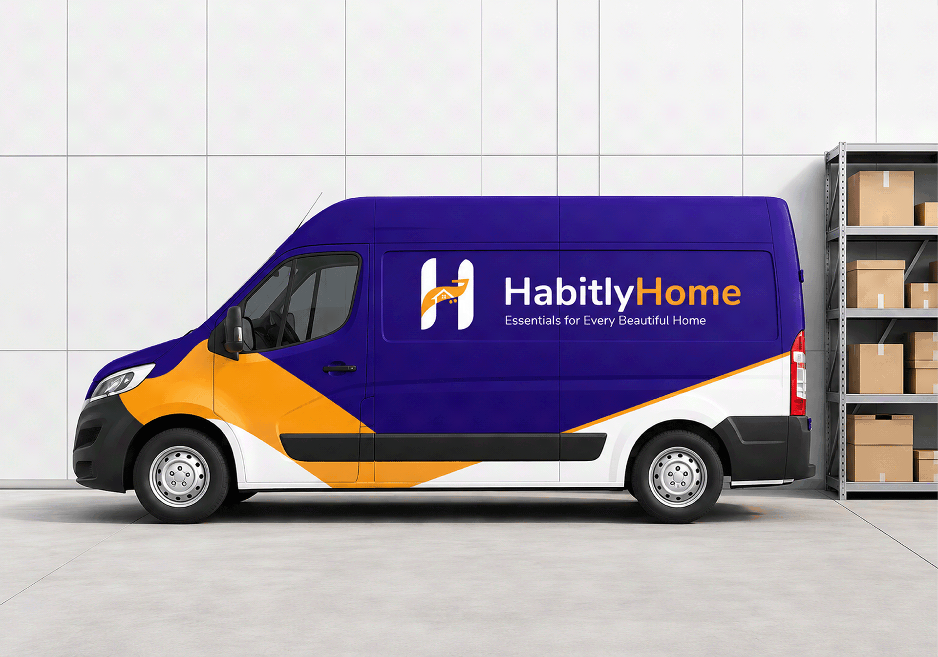
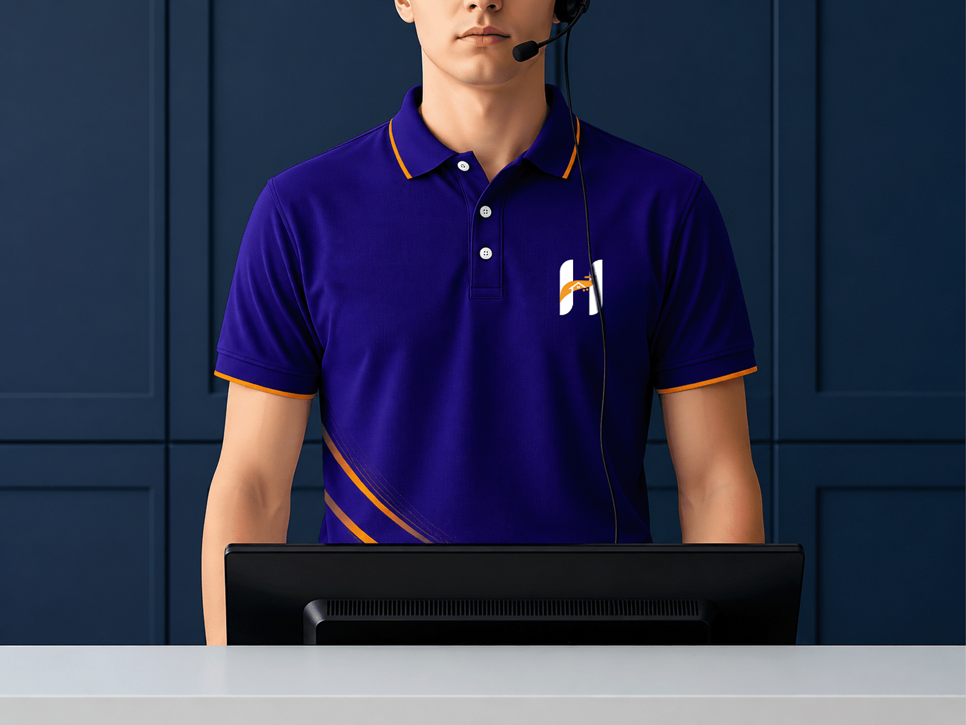
- Deep Navy (#221070): Dominates navigation bars, structural UI containers, and delivery uniforms.
- Golden Amber (#F1A127): Highlights action buttons, promotional callouts, and secondary wordmark lettering.
- Neutral Grey (#CCCCCC): Provides balanced card backgrounds, borders, and subtle structural dividers.
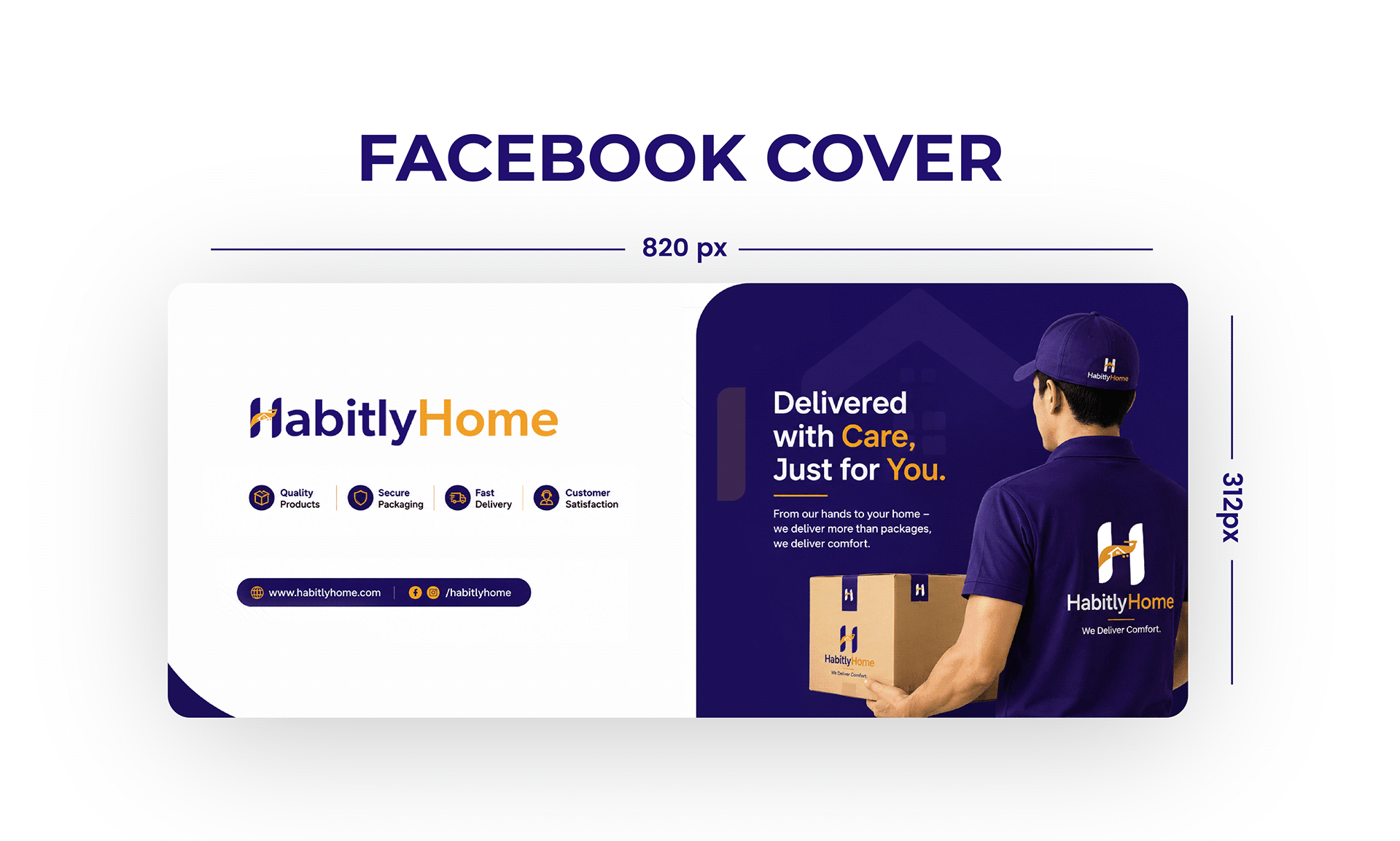
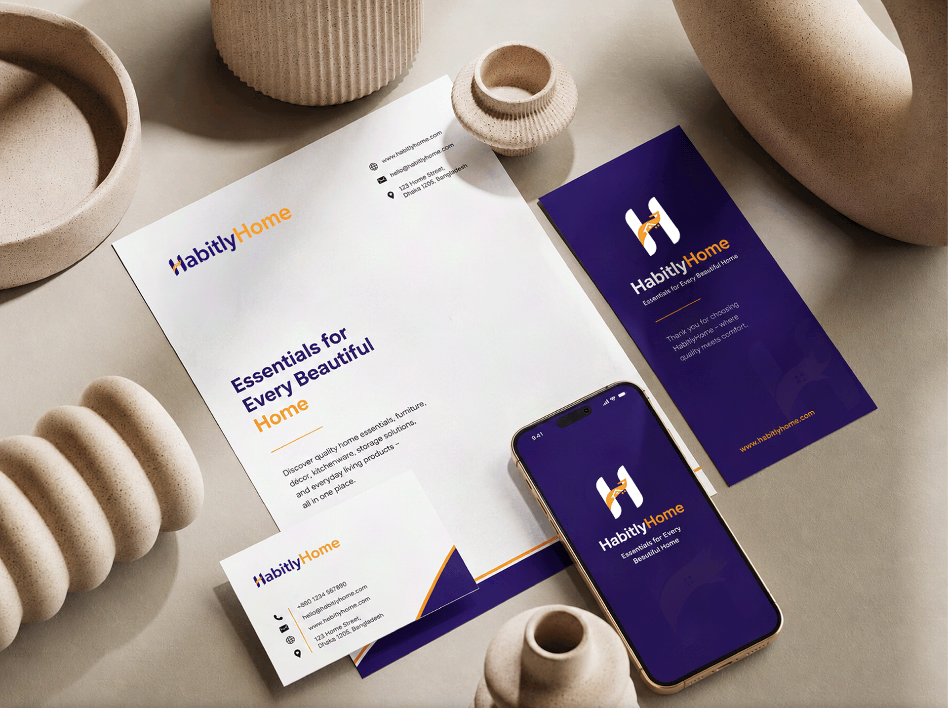
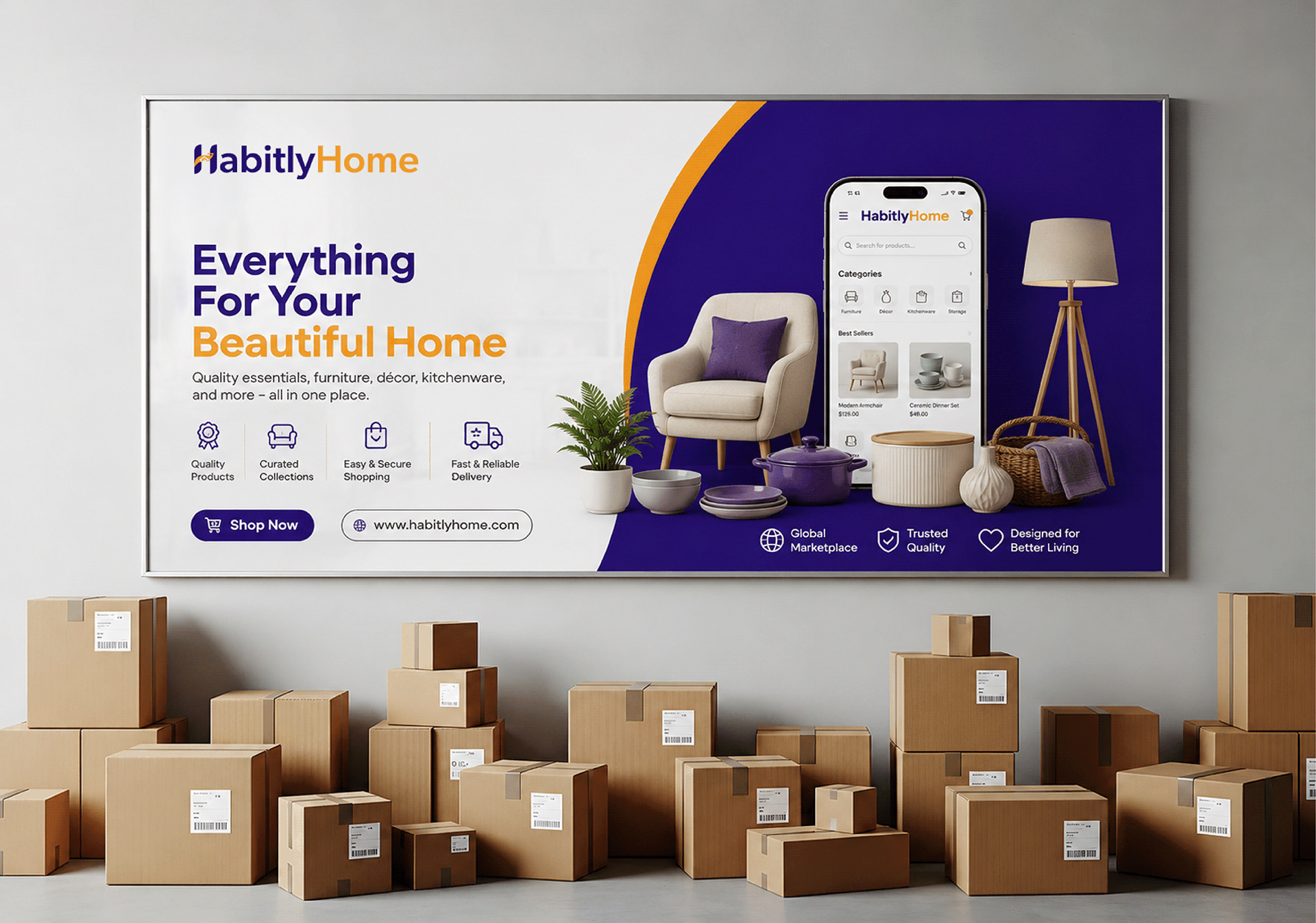
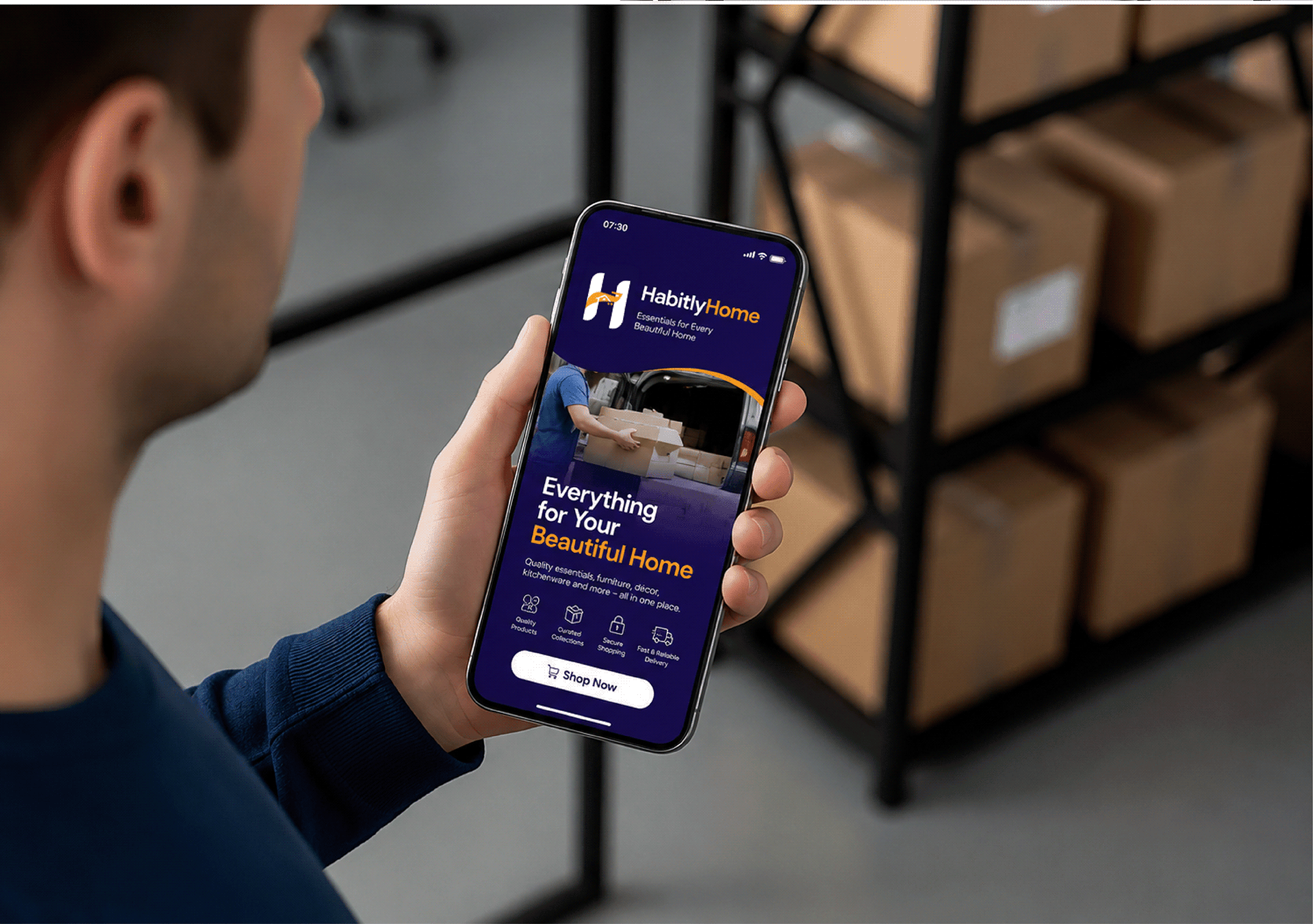
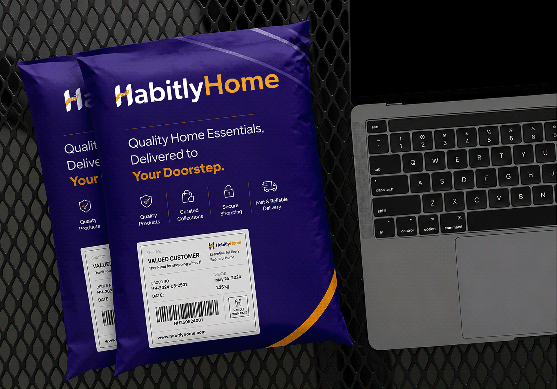
For typography, we selected Gibson Medium to balance geometric precision with high legibility across desktop storefronts, mobile app icons, and physical shipping boxes. We applied these standards across app icons featuring active notification badges, delivery uniforms, cardboard packaging, and scaled social marketing assets like 820px by 312px Facebook covers.
Storefront UI layout and conversion-focused shopping flow
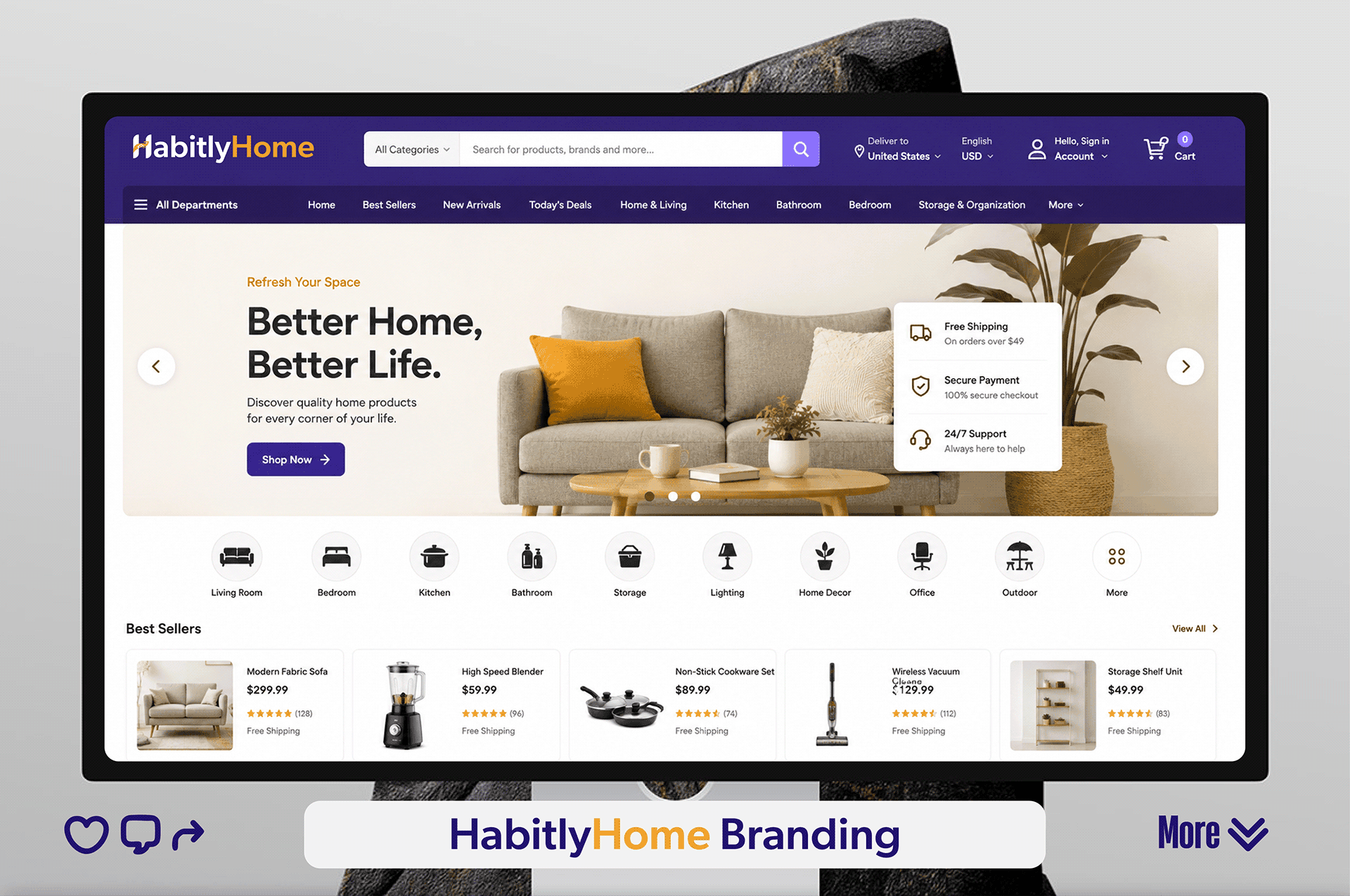
Translating the brand into a high-converting digital storefront required structured navigation and clear visual hierarchy. Our e-commerce design team built an expansive top navigation bar anchored by a deep navy header with category search, department drop-downs, and instant access to cart and account controls.
The homepage hero banner combines warm lifestyle photography with elevated trust badges. Floating overlay cards highlight key service commitments directly alongside the primary CTA: Free Shipping on orders over $49, 100% Secure Checkout, and 24/7 Support.
Data-dense product grid components
Directly beneath the hero slider and horizontal icon category navigation strip, the 'Best Sellers' grid organizes product discovery through structured content cards. Each component features:
- Clean product thumbnail imagery framed in soft white rounded containers
- Item titles set in legible sans-serif typography
- Bold pricing tags ($299.99 sofa, $59.99 blender, $89.99 cookware set)
- Five-star rating indicators with review count tallies
- Prominent 'Free Shipping' micro-copy to reduce checkout friction
This thoughtful UI/UX design ensures shoppers quickly navigate complex catalogs while maintaining brand consistency across every touchpoint. Looking to scale your storefront? Request a free UX audit to pinpoint friction in your store.
The Case Study



Our project brought joy to their experience
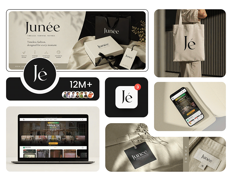
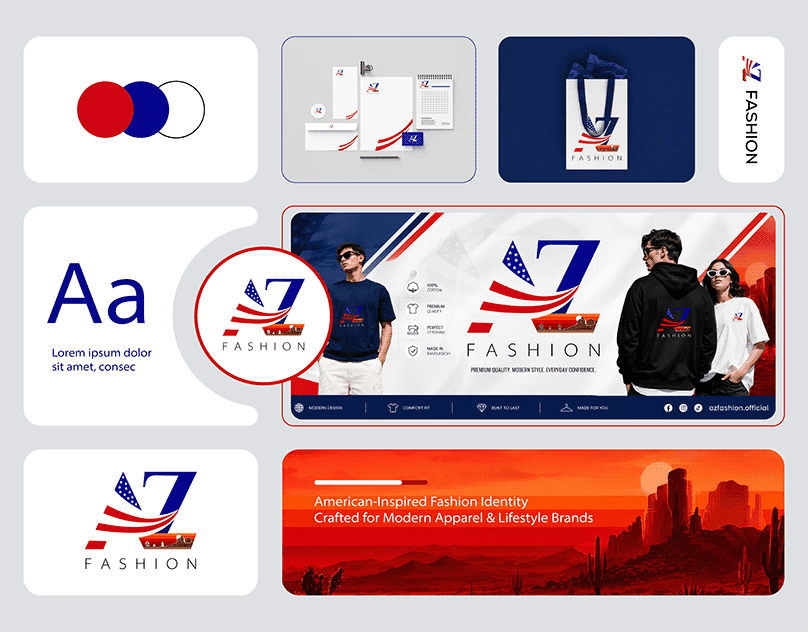
An export-import company name AZ Fashion . Have Buying house on Bangladesh exports fashion clothes to USA. Branding Hero sub brand of UIUXHero designed their Logo , branding and brand style guide and Ecommerce Website design.