Aelvo — Brand Guidelines
Stack
Adobe Illustrator, Adobe Photoshop
Timeline
Not specified
About Project
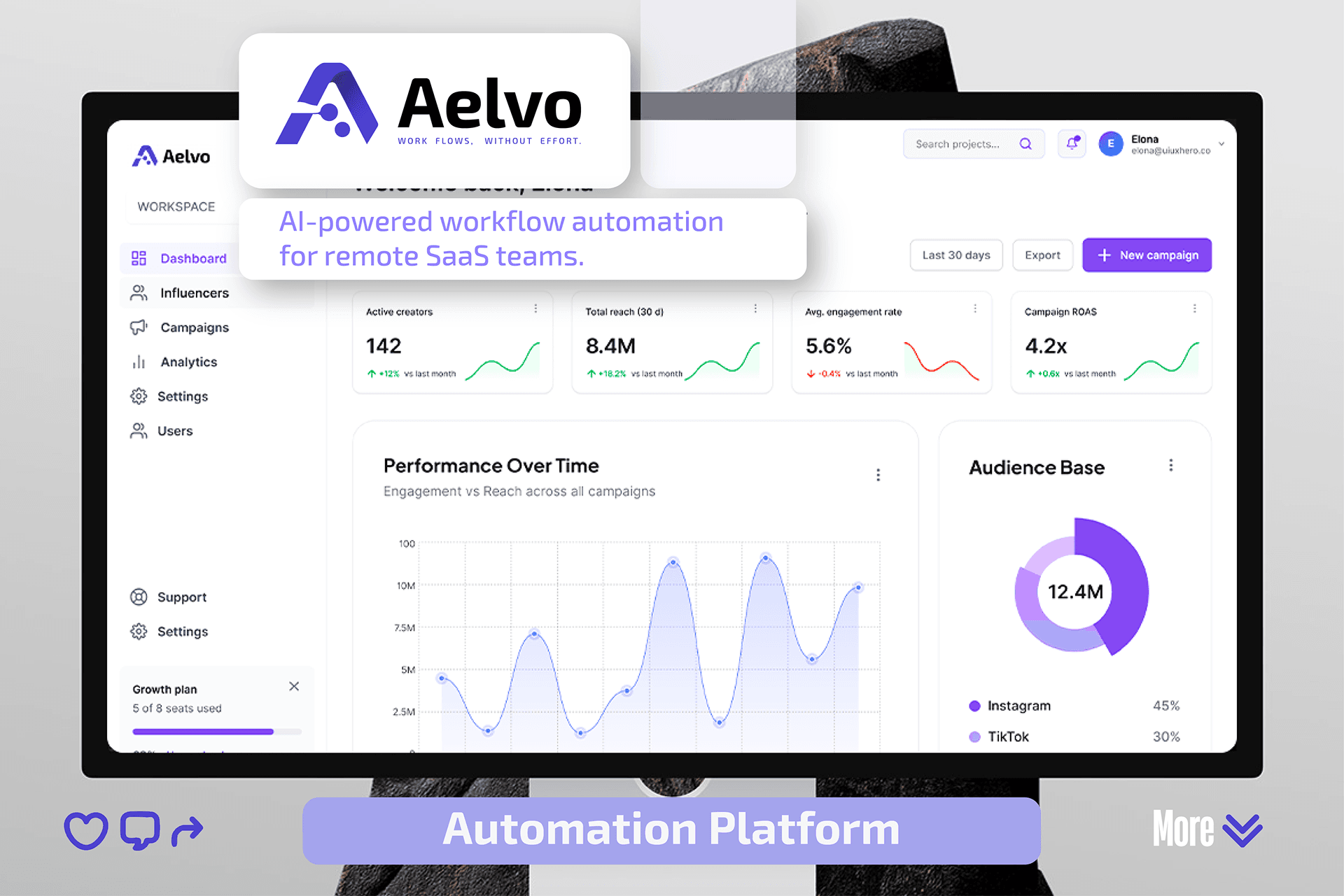
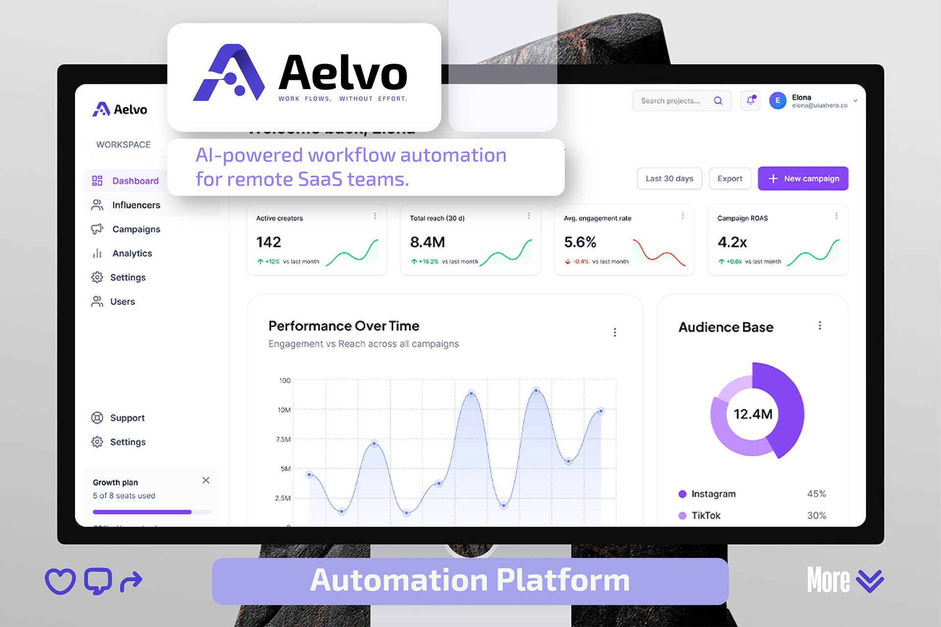
Aelvo is an AI-powered workflow automation platform built for remote SaaS teams — a product whose whole promise is that work moves without anyone having to push it. The brand had to carry that promise before a single feature is explained, which became the positioning line the identity is built around: "Work flows, without effort."
We built the full identity system: a connected-node monogram, a typographic voice, a violet-led palette, and the application rules that keep all of it consistent from the product dashboard to a business card. Every asset in this case study is drawn from the delivered brand guidelines document.
Positioning & Brand Idea
Automation products sell relief, not features. We anchored Aelvo on the feeling of work moving on its own — effortless flow — and let that idea drive every downstream decision, from the connective marks inside the logo to the calm, low-contrast surfaces of the UI.
- Audience: remote SaaS and growth teams running campaigns across distributed tools
- Positioning line: "Work flows, without effort."
- Personality: intelligent, calm, modern — confident without shouting
Logo System
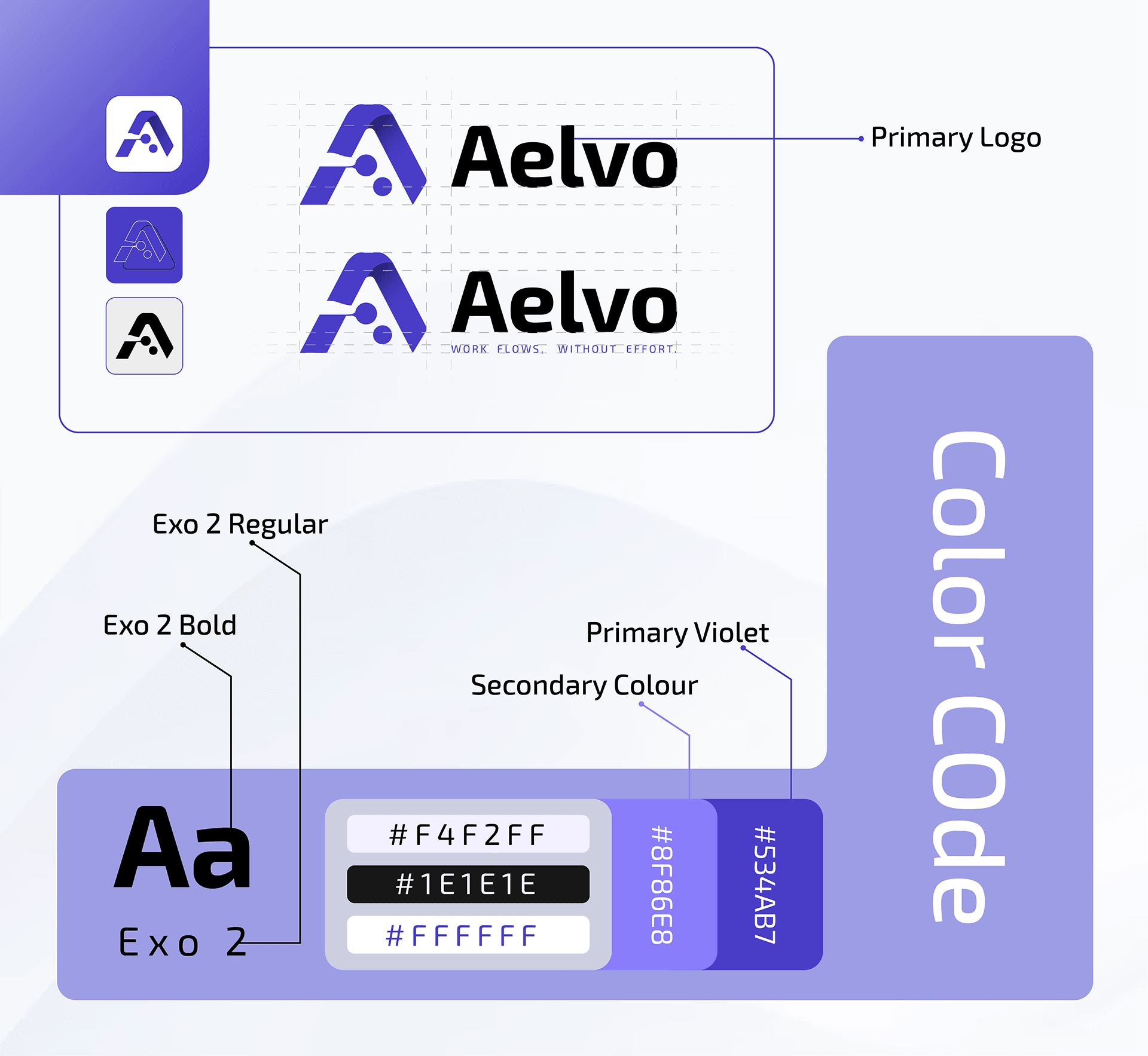
The mark is an A monogram built from a folded ribbon, with three nodes threaded through the crossbar — a workflow passing through a single point of automation. It is drawn on a modular grid so it holds together at favicon scale and at billboard scale alike.
- Primary horizontal lockup, with and without the tagline
- Standalone monogram for app icons, avatars and favicons
- Three icon treatments: white, violet, and single-colour mono
- Construction grid and clear-space rules for consistent placement
Typography & Colour
Exo 2 carries the whole system — Bold for headlines and product titles, Regular for body and interface copy, and letter-spaced small caps for the tagline. The palette leads with a deep violet, softened by a secondary tint and a near-white ground so dashboards stay readable through long working sessions.
- Exo 2 Bold — headlines, logotype, product headings
- Exo 2 Regular — body copy, UI labels, tagline small caps
- Primary Violet #534AB7 · Secondary #8F86E8
- Surfaces: #F4F2FF tint, #FFFFFF base, #1E1E1E text
Product Application
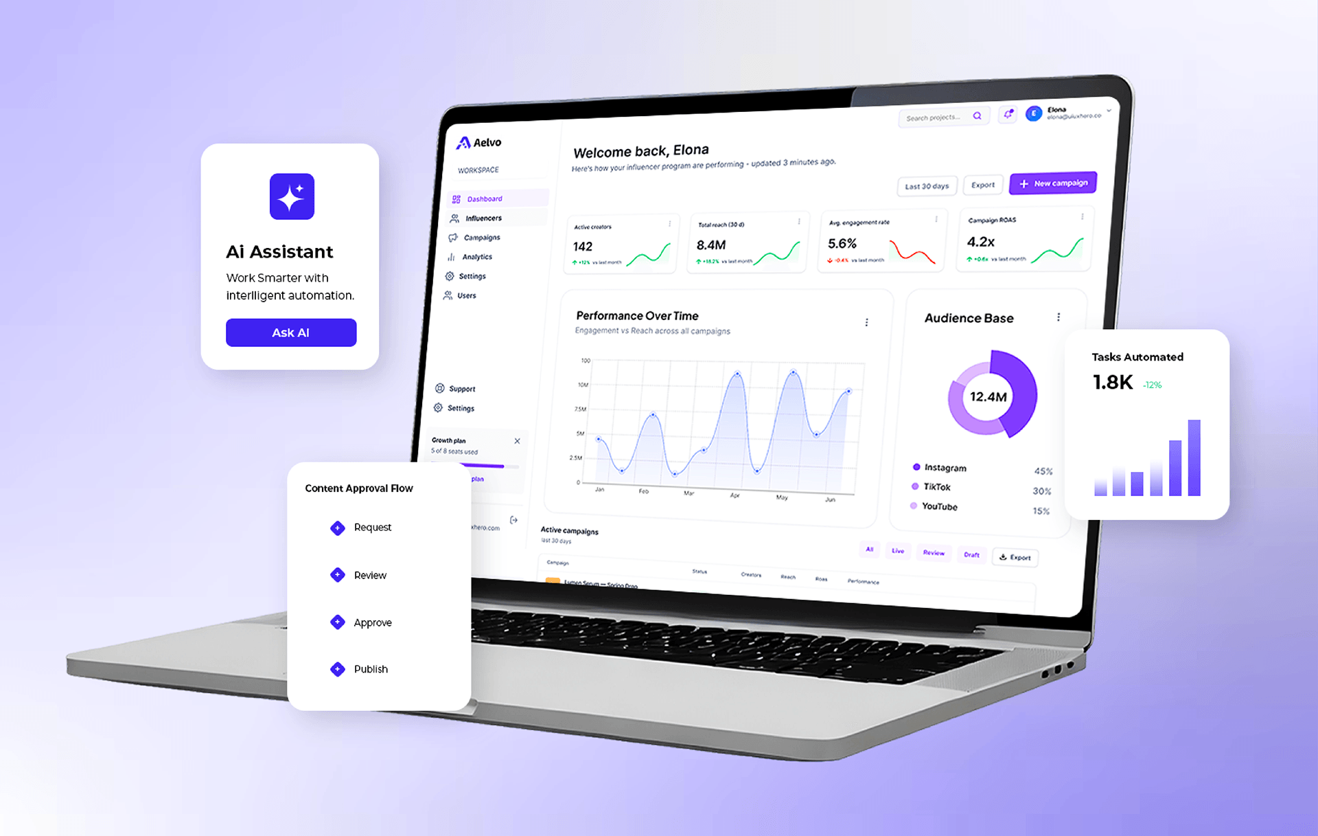
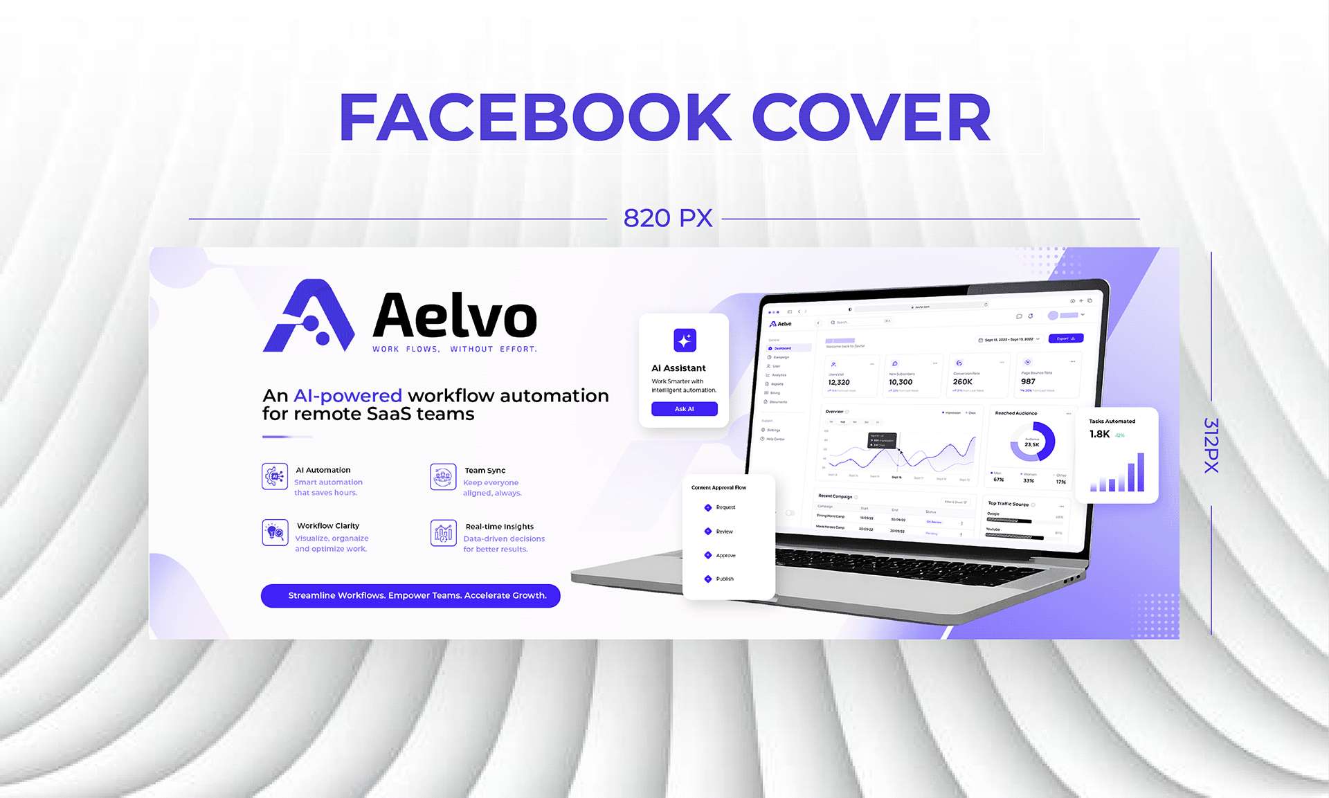
The identity was pressure-tested where it matters most — inside the product. The dashboard puts campaign health up front (active creators, total reach, engagement rate, ROAS), with the violet reserved for actions and data emphasis so the interface never competes with the work in it.
- Workspace dashboard with KPI cards and performance-over-time charts
- AI Assistant entry point — "Work smarter with intelligent automation"
- Content approval flow: Request → Review → Approve → Publish
- Audience breakdown and active-campaign tables in brand colour
Marketing & Collateral
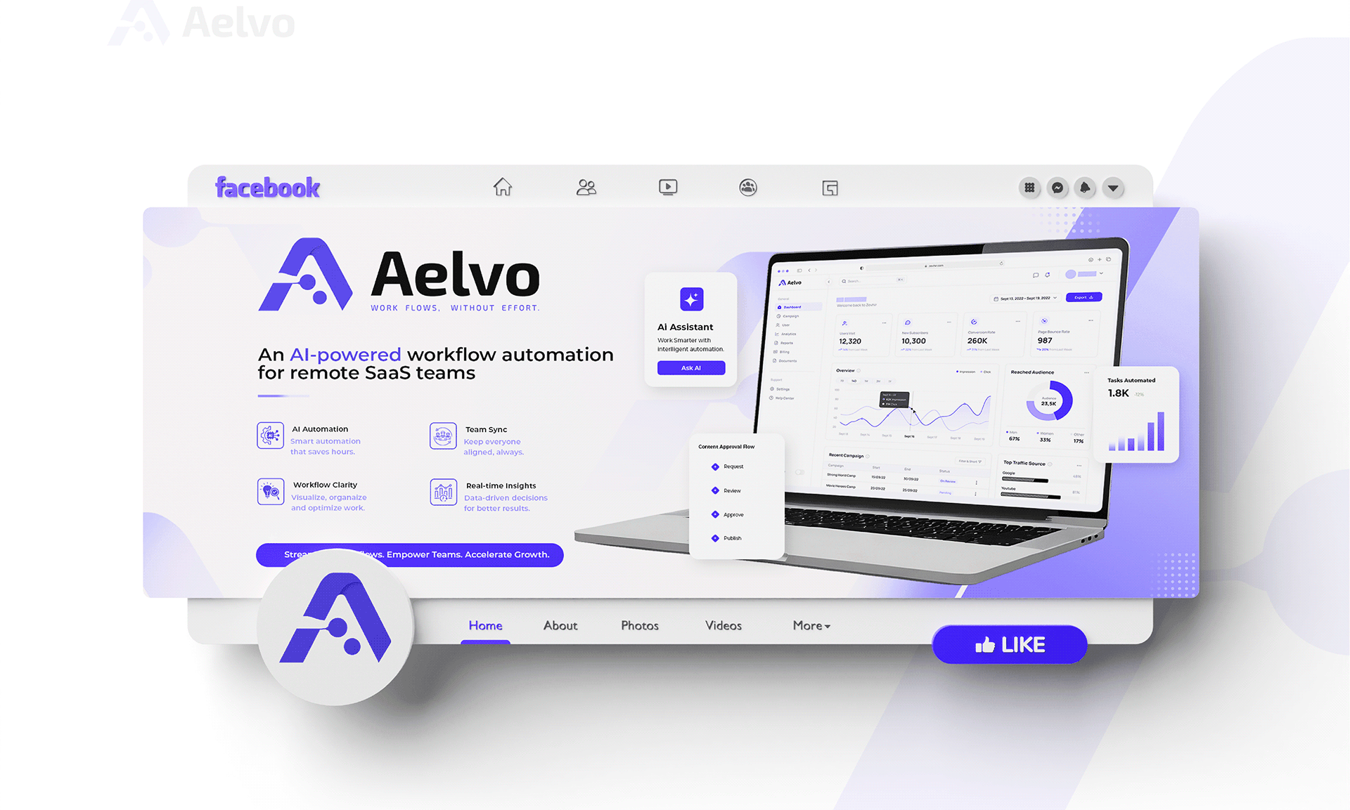
Finally the system was extended to the touchpoints a SaaS brand actually launches with, each specified at production size so the team can ship without redrawing anything.
- Facebook cover artwork at 820 × 312 px, plus the profile mark
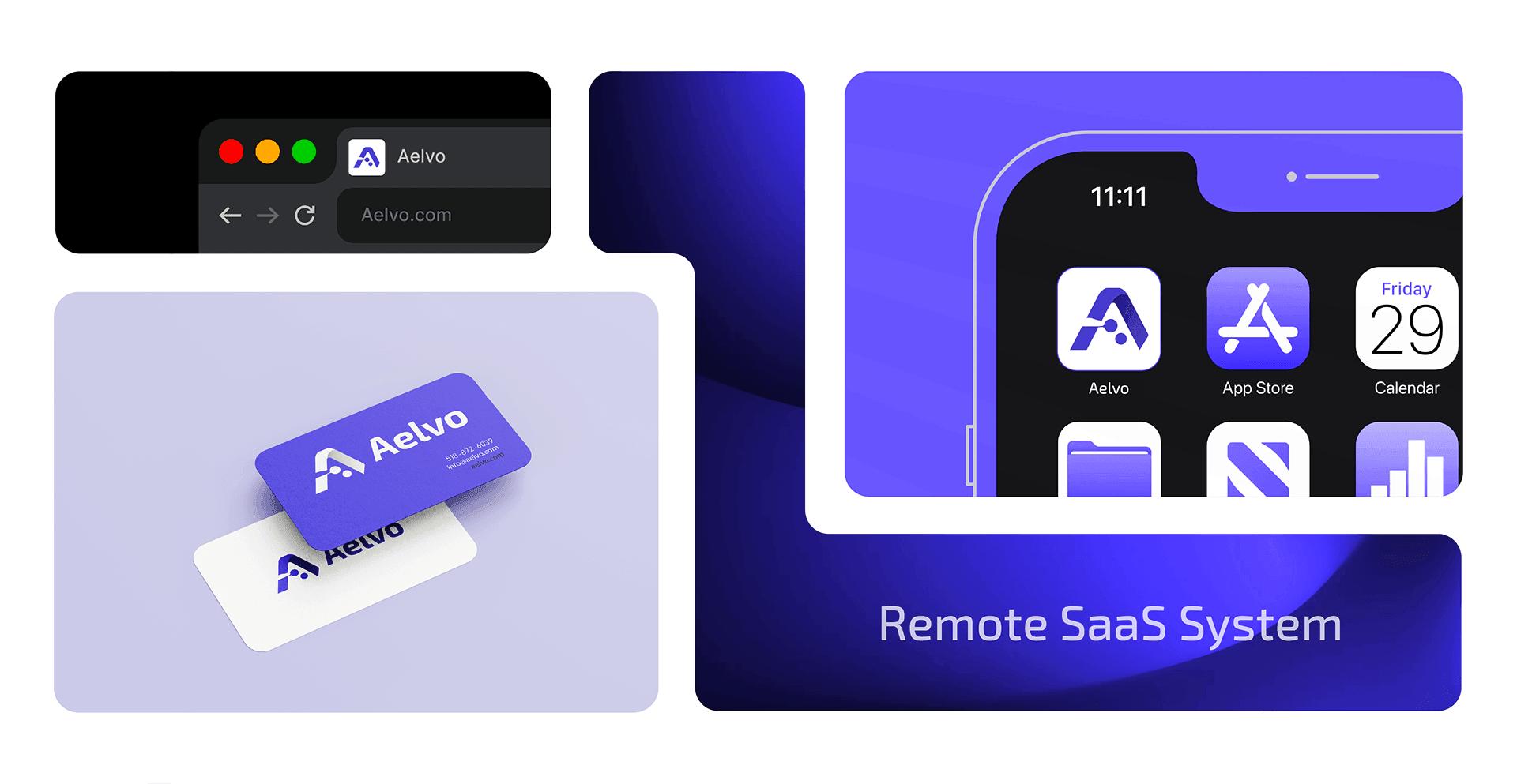
- Business cards in violet and off-white
- Browser tab favicon and iOS home-screen app icon
- Feature messaging blocks: AI Automation, Team Sync, Workflow Clarity, Real-time Insights
The Case Study

Our project brought joy to their experience
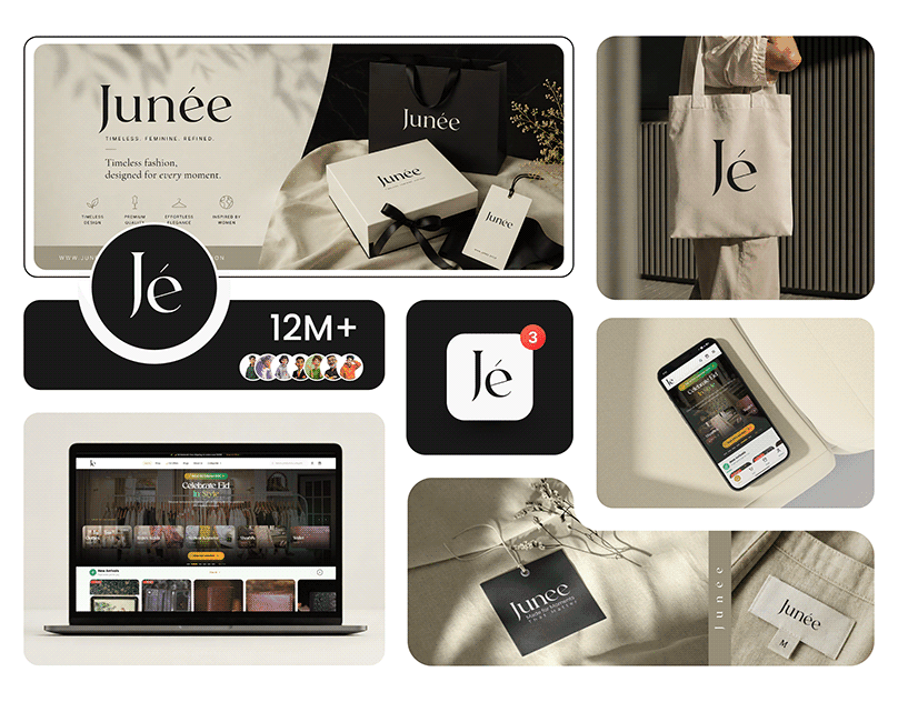
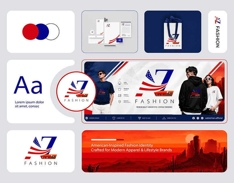
An export-import company name AZ Fashion . Have Buying house on Bangladesh exports fashion clothes to USA. Branding Hero sub brand of UIUXHero designed their Logo , branding and brand style guide and Ecommerce Website design.